Lately, we’ve been asked repeatedly, which tools and workflows we apply to the design process. The whole process of designing a User-Experience goes from a potential users’ touchpoint like marketing, support and other contact channels, to usability engineering with requirement analysis, requirement documentation, prototyping and usage tests all the way up to design aesthetics. Requiring a number of different tools, this blog post focuses on the ones needed for interaction between the trades involved in the process.
In our experience, the team and stakeholders, who need to access the design resources are a highly heterogeneous group. Lots of different roles with their points of view and skill sets do need to be supported to make the process effortless and effective.
Just to give a short example: a interface designer working on an app interface will at some point ask its peers for feedback on the current iteration. Ideally, they will reply with some improvement suggestions which then must be integrated into the current state of the design. At this point, the customer is also involved and asked for their opinion before the whole design is handed off to the development team.
Therefore, the tools we use need to provide a good basis for discussing visual assets and for versioning those assets to keep track of suggested changes and making them reusable for future use and reference. Easy prototyping allows for valuable early customer feedback. Once everything looks good and is ready to be built into the app, the developers need design assets, dimensions and a solid understanding of the intended action flows through the app.
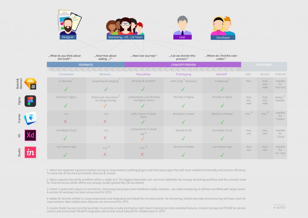
Currently, a lot of different tools tackle this domain and are being discussed by the design community. We want to emphasize that all tools have their strengths and weaknesses. This overview focuses on the aforementioned workflow that we like to use in our projects. We always aim for a complete set of features with the fewest tools possible. The following graphic visualizes the state of the most prominent and wide-spread tools as of April 2019.
We prefer the composition of Sketch, Abstract and Invision because of its great coverage from the workflow to tooling. Where circumstances rule out the possibility of utilizing MacOS, Sketch cannot be used. In those cases, the next best option would be Figma. Even though its versioning has not the same depth and capabilities as Abstract, it would still be a good choice.
Framer and Invision Studio are amazing when it comes to animation design, but they are not yet ready to cover the rest of the workflow. Invision Studio seems to be a promising prospect and we will definitely keep a close eye on it.
A high coverage of the described workflow is preferable for smaller teams and a must for larger teams and long-running, complex projects. We conclude that there is no one truth when it comes to choosing your tool stack as it is highly dependent on the project at hand. That’s why we always query our customers for their needs and plans to then be able to recommend the right set of tools for their project. Thus, if in doubt, ask us!
Update 06.2019
XD shifted from Symbols to components which come with some basic anchoring features. One can also upload a xd document to the adobe cloud and link it with other xd files from there. This esentially is a move towards library functionality. As of today there is no versioning or conflict resolution tooling for these files and therefore XD is still not feasible for the process described above. More collaboration features are announced for 2019.
We updated the graphic to reflect this new set of features.

